~Statement of intent~
My current theme is colour, I aim to produce a website showcasing my ideas. I hope to be able to demonstrate my creative skills and progress throughout this period of time. At the beginning of my project I will create a mood board and coggle, both are a starting point for me building my website, representing my plan for the theme. As I am hoping to present my work on physical objects (such as bags and a dress) as well as putting the photographed objects with my images as the cover on my website. At the end of my project my images will be in galleries with my best and worst images underneath. My galleries should show the singular images I will take as well as my designed bag and dress that I have created using my own photographs. In order to gather a better understanding of this theme I have chosen to research two photographers linking with the work I aim to complete, the photographers I will be researching are Vanova Alicia, and Marine Taylor. I have chosen Alicia as she uses a range of coloured flowers in her photographs which I am definitely going to be doing, and the reason I have chosen Taylor is because they use a small range of pastel colours and make the photograph seem more interesting, I think her work is eye grabbing, the way they use less objects to make the image stand out from the others. Although I am not going to use the exact same techniques as these photographers I am going to use some aspects of their work on my own. I will create a mind map and a mood board expressing my ideas, this will give me the first step to developing my work further, although I have done a project in photography already, I have never explored colour, this is why it is important for me to have an idea of what exactly I am going to focus my work on. The mood board and mind map will allow me to see how my ideas fit together, and if they don't I will need to improvise and find ways that they do fit in with each other. The first shoot I am going to do is just photographing a range of different brightly coloured flowers, this shot will be a location shoot and does not need a backdrop or lights, I will simply just be using my phone camera and the flowers I find. However my next shoot will start to gather my ideas into a final outcome eventually. I intend to paint a selection of flowers and photograph them, after this process it will lead to one of my main ideas in this theme, which is creating a bag out of my own images. I will also develop my ideas in photoshop, my initial idea was using my pictures of my bag and other creations, I am going to put them into a magazine canvas, and my own canvas creation to create a magazine cover. I am going to experiment taking images with a manual camera, but also my iphone camera. I think this is an important process to show my ability to take photographs using a selection of different cameras. My progress will be shown by having my work in order, of course my first set of images will be at the very top, leading down to my newest images at the bottom.
~Vanova Alicia~

This is the website where I found the image: https://www.thephotoargus.com/20-beautiful-examples-photography-using-vibrant-colors/
~Context~
This is a photographer I have found on the website but I am unable to find much information about them.
~Composition~
Looking at this picture I can see that the foreground is close to the model and so we have a shallow depth of field. I can see the photographer has used the rule of thirds in this image, the photograph is split into thirds which you can see, her eyes and flowers are in one third of the photo, her lower face and neck is another third and the last third is her shoulders, this makes each part stand out individually. The colours in the photo are quite bleached, however as her necklace, lip colour and eyeshadow are a vibrant red they are able to stand out from the rest of the photo and are attention grabbing. The shapes of the flowers allow the image to have visible leading lines, I can see the flowers are pointing downwards into the corners, this creates almost a triangle shape around her face. The image is a studio shot and the model has the lighting pointed directly on her face, this is what creates the bleached out effect on the image. As the light is pointed directly on her face there are very little shadows making the image shallow, therefore her face looks quite flat. The background is also quite a dim bleached colour, this allows us to focus our attention on the model rather than the background.
~Connection~
I personally really like this image, I think that the difference between the colours makes the image stand out from others. The light pale blue of the backdrop in comparison to her vibrant lip colour is unique and possessing. The models pose is also very pretty and appealing. The flowers on her head look almost like a hot which I think is very unique and outstanding. I like how all the flowers above the model are also all bleached out and pale but hidden in the bunch there is a red flower which is matching her striking makeup and accessories. The image is also a clear example that the bleached out effect isn't always a bad thing and can be used for great photography. I think the photographer using a bleached out effect was perfect, if the photo wasn't as bleached there would be shadows which would perhaps make her face stand out more than the other importance pieces of the image.
~Comment~
I really like the use of colour in this image and the way the red stands out against the pale blue background, which is the opposite colour on the colour wheel. I might use this contrasting technique in my own photography work.
~Marine Taylor~

This is the website where I found the image: https://www.hiyamarianne.com/stop-motion-animation/
~Context~
"My name is Marianne Taylor and I’m an Art Director and Photographer working with colour-loving brands all over the world. Previously based in London, I now live and work from my little studio on the rugged Atlantic coast of Cornwall, South West England. I can help your brand get noticed in a good way by sorting out your photography, from concept to production. I thrive on creating fun still life images and stop-motion animations with loads of colour that make your potential clients sit up and take notice. I have just one request: You need to be able to enjoy the journey and trust me to create imagery that breathes colour into your brand!"
I have gathered this information from: https://mariannetaylor.co.uk/talmo-pastel-coloured-product-photography-cute-tech/.
~Composition~
I can see this photograph is a studio shot, also with studio lighting. The studio light is most likely stood up on a stand above the frame of the photo which is shown by the shadow of the objects. The angle that the photo has been taken at defiantly looks to be a birds eye, this is important in making the photograph, if the camera was placed at another angle it wouldn't have gave the photograph a special look, obviously the image may look quite bland to a normal human eye, however by analyzing this image you can see that the photographer has actually took plain objects and made the photograph look very eye-grabbing. This is due to the spacing of the image, in my opinion the focal point is the heart, the brightly coloured needles stand out from the rest of the pale, pastel colours filling the rest of the frame. The leading lines coming from the wire in the container points to the heart making the heart the center of attention. I think the way the photographer has used shapes in their work has been done very smartly, the line that leads to the heart has a spiral in it which makes the photograph have more definition. The image seems to be cropped, however it isn't tightly copped meaning it is not cutting out any aspects of the image but it has been cropped so there isn't too much background in the frame.
~Connection~
I have chosen this image purposefully as it links with my work, it doesn't exactly link with the objects I am going to photograph however, the colour chose does. Which obviously the colour chose is the most important factor when doing this theme. The photograph contains pale pastel colours which I am going to use somewhere in my work later on.
~Comment~
I do like this image very much, this is due to the image seeming like such a plain simple one but further analysis says otherwise, the photograph has been very smartly taken and prepared, I am hoping use this photographers techniques when doing my own work. This photograph demonstrates how a single object can be turned into something very pleasing to look at.
~Coggle Mindmap to show my first ideas for colour ~

For my overall project I have thought about putting my ideas into something I think is much more creative and outgoing, my ideas start from painting objects such as fruit and flowers. Then moving them onto a larger idea of bringing them onto the technical side and turning my photographs into patterns I can then turn into the main part of transferring the edited images onto a paper dress.
~Mood board to show my first ideas for colour ~


Shoot one:
I am going to do some mobile photography so that I can go out on location and capture the natural colours around me. I will start off my taking photos of flowers and then try and capture the different colours in the sky.


~Shoot two~
For this shoot I am going to use is a Canon DLSR camera which may be put on to a tripod which will allow me to get a series of different images with a straight, clear camera angle, the tripod also helps allow the image is still and focused.
I will use a pastel coloured background using pink purple and yellow pastels. Then to match the theme I will need to paint objects such as, three lemons and a flower to showcase the creativity I can achieve with this theme. This links to my research with the pale colours used by Marine Taylor .


~Next steps~
I have added my images into photoshop and manipulated the colours slightly.
Then, I have printed out my images and cut around them and created a collage into a bag to extent my colour theme.
I will again use a DLSR camera, I will shoot the process of making my bag. After I will take shoots of my bag outdoors then to get a wider range of photos i will do some indoor shoots with a coloured backdrop.
~Shoot three~
~Bag preparation and shoot~


~Best and Worst~


~Best and Worst~


~Best and Worst~


~Best and Worst~
Developing my theme further:
Having taken photos of my collage bag, I wanted to develop it further in Photoshop. I have experimented with putting my bag idea onto a magazine cover


~Shoot four~
My plan for my next shoot is to gather perfume products and take a range of different photos by organizing them into an LED shooting kit, the kit has built in lights and a range of different coloured backdrops which I will be using, I will also use a DLSR canon camera that's going to be placed on a tripod for different angles also allowing the camera to be steady. I will use different coloured fabrics to have a better selection of photos.


~Shoot five~


~Shoot six~
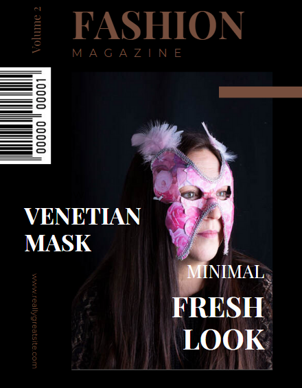
For this shoot I am going to use a mask I already made from my own images, that I have formed into a mask. I am going to have a model wear my mask also. I'm going to use a black backdrop to enphasize the colour of the mask
Here I have photographed my model in a mask I had made, I made this with my own images I had taken, at first it was going to be filled with perfume and other shoots I had doe, however I felt that keeping to pink flowers would have created a better outcome. Venetian masks actually represent so many different things, originally the mask was adorned by members of all socioeconomic classes to represent anonymity. Some people also see the mask as a chance of freedom and an escape from reality.


For this edit I am using a website called canva to create a magazine cover for my images to go into. Although this isn't the best outcome I now have knowledge on hw to use this site, therefore I will learn from my past edit and will be able to develop other pieces of work using this site.


For this edit I tried my best to make a magazine canvas from scratch, again isn't the best outcome but this is my first time creating my own canvas on photoshop.


~Final Gallery~


